Wednesday, April 30, 2008

The blue wedge


Blue is my favorite color, but this is not my favorite block, and I'm not sure why. It may be that I don't like that orange leaf button in the button cluster, though I think it'll look better when it's across from the orange block. However I am open to suggestions on ways to improve this; whether they have to do with the orange leaf or some other component.

Monday, April 28, 2008

Lace to dye for


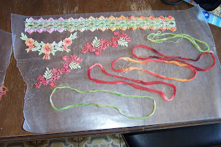
I've been saving up cotton crochet thread, and lace yardage and motifs to try my hand at Kool-Aid dyeing and finally did it Saturday morning, with mixed results. I love how the laces came out. Especially the fish motif, who will soon be swimming on a peachy, orangey, rusty wedge shaped block. The threads, however, did not come out in a usable form. The colors were okay, but I think maybe the Kool-Aid made the fibers brittle, because when I started winding them onto cards, they just broke every few inches. I know it's partly because I used some who-knows-how-old thread that I bought at Sally's, but it also happened with the new DMC perle cotton that I used. Maybe the acids in the dye were just too much for the threads. Too bad, I got some fun variegated colors.

I used fruit punch (in a store brand drink mix) and orange, grape, and lemon-lime in K-A brand. The fruit punch made a nice red, and a watered down bit of it in a wash over the green made a nice foliage green. The green by itself was a bit bright for what I wanted; pretty, but not very natural looking. The grape was pretty much dark grey on the lace, though it did help to add a few drops of it to the red; this made a dark burgundy color full strenghth and a dusty rose color diluted.
Yesterday I went to buy some blue K-A and some lemonade. Will try that soon. All in all, I had great fun playing with the dyes. Michaela was insulted that I used Kool-Aid in such a manner, however. She would prefer to drink it.

Thursday, April 24, 2008

Center circle for the color wheel


When I went to find my blacks, whites, and greys, I didn't have as many blacks as I thought and only one true white. I did have two really fun ties in shades of grey. On to the blue.....

Monday, April 21, 2008

Red wedge, center circle, and the wheel so far....


I resisted putting pink in the fabrics of this piece because I didn't want it to look to Valentine-like, but I did go ahead and work in some pink in the beads and tiny flowers. There ended up being a whole lot more green on here than there is red on the green block, mostly because I have a lot of shades of green in perle cotton and only a few in red. I do know that strawberry blossoms are white, but since there is no white allowed on the colored blocks, these are pink.

The center circle is black, white, and shades of grey. The two prints are from men's ties that I've collected from thrift stores. It was really fun looking for buttons for this block, as I have many many buttons in black, white, and grey.

And here's the wheel as it is so far. I've done some embellishment to the center block, but the blue and orange are still bare.

Monday, April 14, 2008

Yellow wedge


I am much more pleased with how this turned out than I thought I'd be. Yellow is the hardest color to use monochromatically, in my opinion. My fabric goes from palest yellow silk to deep gold satin, and the center patch of yellow, gold, and brown brocade. My threads are similarly limited, so I used ecru too, and metallic gold. Same for buttons; an ecru one for the center of the "sun" and metallic gold for the balancing buttons under the giraffe and the heart with the pansies (I do love pansies).
Just a funny remembrance: Once when Michaela was in 1st grade she was asked by her teacher what her favorite flower was and she said, "The scary ones." That confused the teacher, but I knew exactly what she meant. When she was about two, she was scared silly of pansies. Show her one in a pot and she'd run. Their little "faces" looked menacing to her, I guess. She wasn't articulate enough at 2 to explain her fear, and by first grade she'd made friends with them, so we'll never know for sure.

Saturday, April 12, 2008

Green wedge done


Here's my green wedge. I started with the tree and have placed it so it should be growing upright when the wall hanging is assembled, but you never know. This is about the 3rd tree I've done in this method and I like how they've come out. This one is apparently a cherry tree; it has tiny bead cherries that look ripe and tasty. Actually, with the scale, they look more like apples.....okay, it's an apple tree, with tiny bead apples that look....you know.
Check out my little frog. I've done this guy before and think I may have "invented" using chain stitch to make a frog. This is the first time I've added beads to his body, though.
The lady-head button is silver toned, or was, anyway. I gave it a couple of coats of green fingernail polish which made it just slightly greenish.
The star design is one I collected from viewing antique CQs that are for sale on Ebay. I've collected quite a stitch library from them over the years.
Now on to yellow!

Thursday, April 10, 2008

Purple wedge for color wheel


Here is the purple wedge, viewed as it will be in the wheel. I may still add more to it, especially in that light patch on the upper right.
First I did all the embellishments in shades of purple, then I added small amounts of yellows and golds. That's the plan for each block, doing all the monochromatic work first, then adding small touches of the complementary color. I'm working on green right now, and the red is so pretty on the green fabrics.
I really like the button cluster. I've been amazed at how many buttons are in my collection in a certain color when I go searching for them. I do think I almost totally depleted my purple buttons now that I've done two purple blocks. Time to shop!!!

Friday, April 4, 2008

Color study, part 2....the wheel turns 'round

I had enough time yesterday to piece the other 4 wedge blocks for the wheel. I don't have a lot of orange fabrics, even with the one I bought especially for this project (and almost forgot to use, duh!). But I did find I had 3 different shades of orange in velvet; a gift from my friend Rebel (Thanks again, Reb!) by way of Taylor's Cutaways, I think it's called.
Now I'd like to pose a question: Since this will eventually be finished to hang, and will therefore always hang in one direction, should there be a "this side up" orientation to the motifs in the patches? In other words, should I make the yellow wedge be the top and the purple the bottom (I chose that way because there is the most light/dark contrast between those two, so it feels more balanced)? I would then make any motifs that need to be seen "upright", like trees, grow so they are right side up when viewed. It would be easy enough with the yellow and purple blocks; they would be large side up (yellow) and large side down (purple), but a little trickier for the more sideways ones. What do you all think?